P.S. this is my 100th post!
P.S. this is my 100th post!
A visit to New York without visiting Dr Sketchy's seemed unthinkable, so I duly went on my last Sunday.
Unfortunately, we were not allowed to take photographs - the main reason I attend Dr Sketchy's here in Glasgow.

A couple of years ago, when I was a newbie oil painter, I really needed photographic reference of faces and bodies to work from. I was still too unsure of myself (and skint) to hire a model, even if I had known one available. Dr Sketchy's was the answer, and when attending regularly I met lots of interesting people who are now friends - including, of course, Fiona Wilson

Not only were we not allowed photographs, there were an awful lot of very quick poses. That can be interesting, if you have the right media with you (the watercolour would have been fine, but the paper was far too thin for using a brush) and if the model holds lots of different, athletic poses. This one didn't - they were all variations of her lying or sitting on the table, with her head almost always turned in one direction. Even worse, although her costume was lovely, it covered a lot of skin as well as her hair, with virtually no bony landmarks visible. For some reason, I like to start with the clavicles, which generally weren't visible - or even guessable!
So I left. Terribly rude, and very disappointing, but I was pretty tired and had packing to do for the trip home the next day.
Oh well. Maybe next time. Meanwhile I am thinking about revisiting some of those old reference photographs.

On the last weekend, I went down to Wall St, sat for a little at the Elevated Acre watching the helicopters and then onto the East River Ferry - this was drawn while waiting for it to arrive.
As I did the full trip - up to East 34th St - it took a fair while - unfortunately more than enough time to get sunburn, despite my factor 50! Ferries are dangerous for that . . . must be the wind.
After such a relaxing morning, watching the sights go by, was an afternoon of shopping. (Several folks have been horrified to learn I only spent a couple of hours doing this - and never went into any of the departments stores. Just not enough time - or the ability to carry anything more home, after all the paint I bought!)
Another thing I didn't have enough time for was sketching like this, which is one of the major regrets of the trip. Ah well. Next time.

There is an attached cafe, where I had one of the nicest meals I ate while in New York - maybe because it was french-moroccan themed, so the food was lighter and less sugary. The interior decoration, as you can see, was rather individual - alligator on the wall, lots of model boats, cake stands, a juke box, and who knows what else!

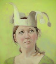
Everyone is invited to Art Exposure Gallery tomorrow night, where I'll be showing the above painting ("The Profile") as well as the two below - the first of my New York paintings to go on show!

There will be nibbles and wine and good chat, as well as my paintings hung in a group (there are a few others going on show) and of course many other painters work on show.


Also recently finished (maybe) is this one, which has also gone through many stages since it was begun back in Vytlacil. She is based on photographs I took of what appeared to be a model shoot at the Staten Island Ferry terminal. There was something about the light that was just magical as well, of course, of all the effort that had clearly been put into her clothes, make-up and so on.
Later that day I visited the Frick, which I heartily recommend for anyone interested in paintings of people. They have an amazing collection of first class paintings that span from Holbein's Thomas Cromwell to fine Degas , hitting various high points along the way. Almost all of the paintings are not only by great painters but are among the best of their works - the Raeburn's , for example, are top notch, which is quite impressive. Having such great works in close proximity makes it very easy to compare and contrast and try to have deep thoughts. There isn't the scope of the Metropolitan, especially as almost all paintings are portraits. This is, of course, also a strength.
So, after seeing all these three-quarter length portraits I wanted to have a go myself - and this is the result. She started out much darker but seemed to become more mermaid-like as she progressed. I had gone on the ferry as I was missing the water (having grown up by the seaside and having a view of the Kelvin from my front window) and every time I started painting it took me back to the pleasure of the ride, the mystery of the sea and rivers, and the unfathomableness of what goes on behind another person's eyes.

Here is the (probably) finished version of The Princess - she was the last painting I started in Vytlacil, and was hung on the wall at the opening while the paint was still wet. Back then, she had a yellow background and grey clothing - originally she started as an exercise in using raw sienna as a background. That didn't work out - turns out the paint was both too opaque and too transparent for what I was after. Never mind, I'll try something similar on another painting soon.
So, now she surrounded by shades of green/grey/blue and is looking much calmer - originally she seemed to have a little bit of a sneer to her, which just did not seem right. A real example of the painting taking over and the reference material being left far behind.
Looking at her here on the blog it is clear I am very drawn to these types of blues - all my most recent paintings are very blue themed. Oh well. Guess I should keep experimenting with the colours . . .
Just spotted something I want to fix. A painting is done for me either when I run out of things to improve, fixing it means starting from scratch, or when it has to be taken to a gallery to be sold. How does everyone else decide?

Despite a woefully rubbish cafe, I enjoyed my visit here, although I didn't bother with any of the trendy, modern stuff. Instead I spent ages looking at second rate paintings, with a few first class paintings thrown in. At my stage of learning this can be very useful - they are, of course, still way beyond me, but tend to show the workings and give me use-able ideas. Masterpieces are great to look at, very inspiring, but often difficult to assess for help in how to paint. It can be hard to use the critical mind when your jaw is hitting the floor . . .

These photo's are of Ribera's painting of St Joseph of the Flowering Rod. Seeing these hands were a jaw-dropping moment, although I can't saw I am too keen on the whole thing - Ribera for me is a first class painter but his subject matter can make him a little hard to love. But look at these hands.


I'd hoped that the photo's might help me show how to paint skin better, but I think that they are just going to be reminders of how important hands can be, and of how much distance there is between my paintings and a class act such as Ribera.
As may be clear by now, I spent a lot of time in New York hanging around the parks. Towards the end of the stay, I discovered Washington Square Park. It is easy to understand why the Fresh Prince chooses to live there in I Am Legend (beautiful, but rather stupid film. Much prefer the book . . . ) although I suppose he would not have the benefit of Caffe Reggio being nearby. The almond pastry I had there was very, very good - on my list of places to revisit.

One of the times I was there, a bunch of folks were sleeping on the benches near the arch (it was about half nine on a sunday morning). Attached to a lead was this absolutely gorgeous kitten - it was bigger than a full grown cat, despite being quite skinny and clearly not yet fully grown, so I have no idea what kind of cat it was.
Lots of pictures were taken, and this is my first drawing - I have a bug in my head about drawing movement which comes out every so often but does not seem to be anywhere near resolved. At some point there will probably be both more developed drawings of individual poses, and more work on the moving theme. Until then, this is it!
 Way back again to the start of my trip, I went to a talk organized by Patricia Watwood at the Forbes Galleries.
The talk was a panel discussion between Patricia, Nelson Shanks, Sabin Howard and Peter Trippi . I had a nice seat near the front and after a while began sketching. Sitting still for more than half an hour is a real trial . . . Obviously, they kept moving, Peter Trippi at the end in particular - while the others tended to go back to the same pose, he was always different. And the hands! They were absolutely fabulous, never stopping, very expressive - even when not talking. Odd that he was the one non-artist in the panel. He saw the sketch later (a very approachable chap) and didn't seem to disapprove too much.
It was Nelson Shanks (the first face in my sketch) whose viewpoint I understood most - he talked very much of the joy of painting what is in front of you and how expressive that can be, and how there will never be an end to the subjects to be painted. The others were more political and a lot of it went over my head - especially as I had not yet realised how very little representational art there is in NYC. It was a bit of a shock to me that my kind of art is seen by some as very old fashioned. But at the end of the day, does it matter? Only in the sense that the audience for my work may be smaller than I'd wish
Anyway, I got to meet Daniel Maidman, who introduced me to Joe Ongie (who is a big Raeburn fan), Nelson, Patricia and Peter, Karen Kaapcke (another great painter) and various other interesting folks. Wine was drunk, the party moved to the Salmagundi Club (which had a startling range of representational art on show, from the brilliant to the embarrassingly bad) and there was much talk of art amongst other things.In the perfect world there would be many such meetings and we would all be better artists for them - it is hard to quantify how much talk enriches, but I have no doubt it does. Otherwise I wouldn't be blogging - so please comment, folks!

The view from New Jersey, just before the bus turned into the Lincoln Tunnel, is spectacular
At the weekend, the bus went across the George Washington Bridge, rather than through the tunnel. This gave a view at an angle down the island, but unfortunately it was raining pretty bad each time I made that journey, so the best I could manage was a shot of the bridge itself.

There are a few more photographs over at flickr
Now, as I mentioned in a previous post, Peter Cox sent me a very long materials list for his workshop - mainly of things I did not have. He had a list of preferred artists oil paint brands - which did not include Winsor and Newton. As you could potentially fail the classes I went to at University if you didn't have the right stuff, I just presumed I had to try and get it all - which took care of the first couple of days in New York. Then, on turning up to the class, it was apparent that virtually nobody had paid much attention to the list . . . that'll learn me!
View New York Art Supplies in a larger map
To look on the bright side, I now have a lot of bright new shiny colours, made by all sorts of different brands, so I can compare and contrast. In the process of buying them, I also have become fairly familiar with several art supply shops in New York, and had several fun hours wandering around them fiddling with all the lovely things on display.
Vasari Paints was the first I visited. I almost missed it, as it is many floors up and along a rather winding corridor full of various artist types. Not what I was expecting at all. Some galleries I never did find, possibly as they are similarly up floors and not clearly indicated. When I got there, there were two people deep in conversation, but the wall full of boxes of paints told me I was in the right place after all. So I had a look at the paints, until the conversation was interrupted for the chap to tell me off for touching his paints. Ooops. So then I stood and waited. And waited. And waited. Eventually I asked if I could buy something and suddenly he sprang into action, till was produced, paint was wrapped (red umber - in the list as absolutely necessary, and certainly seems a useful colour for cooler, dark flesh tones). Still not sure if this was a case of manners being lost in translation . . .
Next (after walking down the Highline and eating a NYC version of a double nougat - ice cream stuck between two cookies.) was New York Central Art Supplies. This place looked very ramshackle from the outside, and fairly dark and dingy inside. But had a more than adequate range of paints as well as some oil painting boards, so I was able to get get most of what I needed. Their specialty is paper - up some hard-to-find, narrow stairs there is a huge range of papers from everywhere, on two racks of boards that can be flipped. You decide what you want, then tell one of the many nattering staff behind the desk and bobs-your-uncle. That first day it was packed out (with about 3 people), so I went back during my last weekend - by then I knew I was at my weight limit, so wouldn't be able to buy any paper, but spent quite some time looking at them, and noting down the ones that might do in my eternal search for a good mid-toned watercolour paper. The one I did identify they didn't have in stock in the colour I wanted, but I do have an alternative to try out sometime soon. Will go back just for this place.
Near to it is an Utrecht store - which seemed to be aimed more at graphic designers etc. Didn't visit others in the chain (although there is one near Blick), so don't know if they are different
The little shop on the ground floor of the Art Student's League was the next stop, before the first class begun, as I hadn't had the strength to buy all the ingredients for the medium - or identified a bottle to put them in. They came up trumps, and indeed seem to have a very good, focused range of materials, all aimed at professional artists. Indeed, with the exception of Lee's Art Shop across the road from the ASL, I saw very little student quality materials at all. (Lee's was about the standard of Miller's in Glasgow - adequate, but aimed more at the craft market)Another place I visited (for Noodler's ink ) was the Fountain Pen Hospital . If fancy pens are your thing, this is the place. And if not-so-fancy pens, or a big range of inks, is more to your liking, this is also your place.
Next up should have been Soho Art Materials , as it came with good recommendations from the rest of the class, but I couldn't find it. After looking twice. Oh well. So I went to Pearl Paints instead. Probably the biggest shop I went to, with a nice big range of sizes of oil painting boards (including ovals), as well as gessoed boards etc. Spent the best part of an afternoon there, looking at all the brushes/pencils/papers and so on.
My favourite of all of them was Blick . It was a bright, open shop, with plenty of room and clearly laid out. The range of oil paints was impressive, as were the watercolours - although they didn't sell pans and didn't have Daniel Smith's range (no-where I visited did. One of the major disappointments of the trip.) Even their bags seemed sturdy. If only the store was at the bottom of my road . . .
Obviously I have missed a few places out - does anyone out there have other recommendations, for the next trip?

To go back, my first week in New York was attending a Masterclass taught by Peter Cox. This was very hard work for me, for several reasons - firstly, I am not a good pupil, hate group situations and classes, as generally feel quite self conscious . Much rather have a book to read. Part of this is that I miss a lot, having problems hearing . Art classes are particularly difficult, as often the teacher is painting and I therefore have a choice between watching their face or their hands/the painting. Difficult - and why I avoid them. Being unfamiliar with workshops in general also made me more awkward, never mind getting used to a new city and a new culture. The dodgy shoulder meant I ended up sitting on the floor, which naturally limited my choices regarding composition and probably irritated everyone else. Getting in from Sparkill by the half seven bus was a trial, and meant missing the first 15 minutes of the class.

To continue with my woes, the materials list sent out (contact me if you want a copy) was huge. At least twice what I normally use - and that was just the "essential paints". Most of my first couple of days was spent finding the right shops and trying to figure out what I needed - so much was in another language (fl oz? turpenoid? coffee can?). And then once the class begun, we only used six colours. Bah. Much of the discussion was around anatomy (the workshop was meant to be on painting clothing. Peter's point was that fabric hangs and moves according to the underlying bony landmarks. These need to made obvious in the painting if it is to appear solid). Not what I was expecting - so as you can see, I got sketching to fill the time. The second drawing was from before he made his point regarding fabric, bony landmarks, and folds.
The first sketch was of the lovely model's head (She was really great), along with notes as to how he recommends laying out the palette - as you probably cannot see, he recommends putting white in the middle, paints at the outside, and premixing strings from red umber, red umber and cadmium red, burnt umber and ultramarine, yellow ochre or raw sienna. These can then be mixed with the adjacent strings, so the yellow ochre with the red umber/cad mix and the b.umber/ultramarine with the red umber. Not something I have continued with, but I have continued using a larger pallete, and premixing a much bigger range of tones and colours - and ensuring the whole thing hangs together before painting.

So, in summary, I hated almost all of it, and ended up with another ugly painting. But something at some point clicked and I now feel I have the basics so I will be able to paint anything I choose. There is a whole world out there . . . . Peter and his model were lovely people (even got a gift of a coffee can from them!) and the other students helpful. Much thanks to the lady who explained that half and half was not semi-skimmed milk, and to Elsa, who as a fellow european could actually tell when I was joking.

On the 24th May, a special day for me, was the Vytlacil Open Studio event. Although I have attended many group openings, this was the first where I was on my own, responsible for the look of the whole thing and looking after my guests. (Although, of course, the other residents were also hosting their open studios. I will post about them some time soon).

For many reasons I had decided to work small during the residency - ranging in size from 10x10cm to 25x50cm. My subject matter was what I had encountered since coming to New York - especially the people in Central Park, where I had spent a fair bit of time, walking from the 57th St studios of the Art Student's League to the museums on the Upper East Side.

The following is my statement for the night - "Coming to New York from Glasgow has been quite a voyage, forcing me to reconsider attitudes and decisions as well as illuminating many possibilities. My first week was spent at Peter Cox’s workshop at the Art Students League 57th building in the mornings and strolling round the museums in the afternoons. Another place I spent a lot of time was in Central Park. Many of the people I saw there became the basis of my paintings shown here today. The museums (and the sunshine) led me to a realisation of how crucial colour can be in loving a painting and has encouraged me to be more expressionistic. Since then I have attended life drawing here regularly and have benefitted from critiques. Once back home my work is likely to experiment more with colour and composition – the journey has only just begun!"

The reward of night was the looks on folks faces - an entirely unfakeable look - and the many great conversations I had. Maybe I might even do it all again, sometime!

The flight home was truly breathtaking, leaving Newark at dusk and reaching Ireland at around dawn. Unfortunately I am not nearly a good enough photographer to catch the amazing light effects in the sky, nor am I a good enough landscapist - even if I had the materials with me.

Tried my best, as you can see. Hard to make mountains look bad, though. And a truly beautiful and heart-warming sight they were, after all that flatness of New York. (To those that tried to argue with me that New York is not flat, Yes It Is. The Palisades are NOT high. Come to Scotland, and I'll show you.) From looking at the flight path provided in the plane, I'm pretty sure this must be Skye. Which is a not very big island, for non-scots. Oddly, staying in a (little bit) upstate New York has made me much keener to go and explore the countryside here - so, if nothing else, the trip has made me appreciate how many good things we are blessed with back here in Glasgow, and in Scotland.
(oh, and here is a little link to a great video - Bonnie "Prince" Billy - I came across it near the start of the residency, and as it shows some of my common haunts, it kept me from being too homesick during my stay.)

This one is a study done for a bigger painting that if you have sharp eyes you may notice in the studio shots. The big painting has been a lot of hassle and I am still not entirely happy with it - will post it sometime soon. This little one (13x13cm), though, just worked first time and is why I decided to go bigger. It is painted on aquaboard, a new thing to me, but appears to be quite common in American art supply stores. It is made by Ampersand (who seem to do a big range of boards) and claims to be of archival quality - "watercolors on Aquaboard can be sealed and framed without glass, keeping colors and textures true to life". The surface certainly feels like cold pressed watercolour paper and is ivory in tone. The paint seemed to take longer than I'm used to, which made me impatient as I was wanting to layer. But this could be a strength, as it would maybe give lots of manipulating time. Will report back after I have used it a few more times.

Beginning to think about getting things together for the open studio (I know, a bit late, right?) so am beginning to photograph stuff prior to putting them up on the walls. Pity it's a dull day here. Anyway, I have tried to take a few progress shots as I go along, and of course the studio shots often show work in progress.

This one is pretty small, hand-sized, and much more intense in colour in real life. Currently I am quite pleased with it, and so was Gary Sussman at my critique last week. It was one of those paintings that come quick - just the two stages that you see here.

Time for an update - painting time is almost over for me, as the paintings will need a little time to dry. Also, the open studio event is on Thursday (yes, this Thursday, folks, do come along if you are in the New York area). So, here are a few shots of how the studio looks now - with a few paintings scattered around. If you remember, I posted some piccies on flickr a few weeks ago, just as I arrived.

As most of my paintings are pretty small (and the studio is pretty big) they don't really take over the space. And I have no idea how I'm going to hang them. Oh well. Suggestions (and help, if you want to come down early on Thursday) welcome!


Life drawing again - yesterday I had a particularly good session - as can be seen more fully over at my flickr page. But that leads to the question, what do I mean by a good session? For me, the process of life drawing is more important than the result - in some ways this is the opposite of oil painting. If I feel that I have spent my time really translating what I see into graphic form, I am happy. Every session there are different problems I am trying to solve, and months can pass trying to figure out one thing. Yesterday was particularly good, as I felt I caught the movement and character of the model (the lovely Mimi) more than I usually do. This is sometimes important, and sometimes not - after all, when anyone other than me looks at the drawing, they are not judging it on its faithfulness to the model. However, I prize life and character, and often feel looking at other folks drawings that what little character is present belongs entirely to the artist. Models (and by extension, as most life models are female, women) have character and thoughts, and moods, too, and this is something I am trying hard to portray, both in life drawing and in oils.

The history of art is littered with empty women, especially in oil painting, and I know this is partly the ladies fault for requesting a painting to make them more beautiful, younger looking, etc. But that can only be an excuse for portraits - not for Titian's mythical ladies, or Renoir's daft teenagers. (to pick on just two - they are still outstanding paintings). There are, of course, exceptions - in the field of life drawing, Watteau's delicate heads come to mind immediately.


This first painting is a little one (10x10cm) that I brought with me to New York, as I wanted something to compare my progress with it. The second painting, same size, same canvas, was my first completed painting here. I hope you all agree that progress has been made, although basing this on two paintings only is probably a bit daft, as of course things are never quite that straight. Not for me, anyway - I find I can do something that I really like, then forget how I did it, and go back to struggling for a while.

Anyway, to me the difference is the use of medium - a mix of stand oil, liquin, galkyd and turpenoid - which my workshop introduced me to. Until now I was using turpentine if painting at home for the first pass, but after that using straight paint. In Life Class it would be straight paint all the way, as it is not fair to inflict turps on other folks. But using the medium allows me to really think out the composition both in tone and colour right from the start and gives me plenty of opportunity to change things around. It also enables thinner layers and glazes, whcih really expands on the possibilities - great stuff!
Turpenoid doesn't seem very available in the UK, though, so I may have to experiment a bit to find an alternative - the manufacturer says it is citrus based, so maybe Zest-It would be the one to choose. Or turps, back in the house, as previously.