Friday 29 August 2014

Superwoman and The Teenager

The Superwoman came first and was a joy to paint - the model hand such capable hands I really felt it was important to paint them, along with the wedding ring and the very practical jeans.

Later I noticed that another model was standing in a very similar pose, but communicating defiance and uncertainty rather than capability and confidence. It seemed natural to explore the differences through colour, with a orange/green rather than blue/yellow pairing, as well as making the second painting much darker overall.

It has occurred to me that this particular stance may be much more common to women than men - I've certainly been both at some point - what do you folks think? And do you prefer one painting to the other?

Monday 25 August 2014

Performance - Jane Gardiner's Solo Show

Today I am recovering after the day before, as yesterday was the private viewing of my first ever solo show, at Mansfield Park Gallery. . If you missed it, the paintings will be there for another three weeks.

And I am knackered, both from the drink, the talk and the relief of my part being done.

So I'm having a couple of days off, today drinking tea, lounging with the cat, thinking of all the lovely things people said about my paintings yesterday and maybe drawing the flowers that Fran Hanley gave me later.

Tomorow I go to Edinburgh for the festival and to see what artists are up to over there - particularly looking forward to John Byrne's two exhibitions.

But I thought that now would be a good time to remind folks of where you can find me elsewherre on the internet.

At facebook I am Glasgow Painter , Jane Gardiner is the webpage, with a listing of exhibitions, a bio, and a link to my mailing list as well as my email address. Flickr is mainly paintings and I'm not around there as much as I used to be. Pinterest is full of ideas but I know some people worry about how easy it is to share pictures and that attribution can be lost. Finally, there is twitter.

Wednesday 20 August 2014

The Romantic

This lady I had hoped to have on the card for the show, but unfortunately she took too long to paint and then caused the poor photographer no end of trouble. Still, here she is now.

She is another big painting at four feet high. If I hadn't been doing the show and trying to make sure I filled the walls I'm not sure I would ever have attempted anything like this - but I'm so glad I did. There is just so much more you can do with more space, with including clothing and hands and little hearts and wild hair, that you just can't do with closely cropped head and shoulders.

Maybe there is a fair bit of romantic in me, too - I'm certainly looking forward to the future, meeting you folks at the opening, just as she is looking towards whatever is next - although we do both have a fair bit of trepidation.

Saturday 16 August 2014

The Classic

Another painting from the show, another back view, another beautiful lady.

This time I very much wanted to contrast the warm colours of her skin and the background with the cool, reserved pose. The most detail in the painting is in the ear, an area of the body that is entirely receptive and very individual. It was this balance between control/lack of control, natural/done, warm/cool that I found fascinating. Her hair and make-up is very classic, hence the name of the painting, and of course bare skin is the most classical garment of all - especially when worn with poise.

Wednesday 13 August 2014

The Clown Princess

The Turn was interesting to paint - not least because it is my biggest painting so far, and the only whole body one - but didn't explore the challenge Donna had set me by wearing whiteface to the modelling session.

This particular pose stood out for me as she looked so regal - almost like Queen Elizabeth the First - despite wearing clowns make up. While she was there we did talk about how the same piece of clothing has different meanings and associations depending on what the are combined with, and one of the things I like about Donna's costume is that each individual item has so many possible associations - the tiara is mine, from my wedding, but is very similar to what debutantes would have worn, as well as the plastic variety each little princess has somewhere. The white make-up has a long association with clownery, but originally was used by court ladies (and some men). Ruffs have also a long tradition, especially in art, that they really deserve their own post. Kohl is of course as old as the hills . . . whereas denim is relatively new but has gathered many associations. Dungarees are workwear, but are also often worn by young children - like those in E.T. Oh, and stripey tops do also have a tradition all of their own.

And those are just some of the more obvious clues - I'm sure each of you will think of your own associations.

Altogether, along with Donna's marvelous eyes and hint of a smile, you get a clown that is ready to rule.

Saturday 9 August 2014

Skin Tones Palette

A couple of days ago I had a terrific lunch at Once Upon A Tart with the very talented Cate Iglis - I had the Victoria Sponge, much recommended. Anyway, we talked of many things, including what colours I used - Cate had thought that I might use similar colours to her, as I use greys in a similar way. As it turns out, I don't, and as I struggled a bit in explaining what I do use, I thought I'd write it all down.

The photo above is from this afternoon, at the end of play. Normally it would be a lot messier as this was really a tweaking rather than a laying down large areas of paint day. You can still see the threads I lay out initially - unusual!

At the top is my greys, mixed from Ultramarine and Burnt Sienna, both W+N artist's oils. Today the mix was more brown than grey, it changes every time. The advantage of this, rather than pre-mixed grey or raw umber is that I can change the temperature fairly easily and that the darks are pretty transparent. Both Ultramarine and Burnt Sienna get used independently, especially the Sienna for hair. White, of course, adds opaqueness, the degree depending on which white (titanium or lead) I am using.

Next is an Old Holland colour, Italian Earth, which is basically a less greenish yellow ochre. As you can see, it is a mid tone out of the tube and I progressively lighten it to a tone a couple of stops darker than white. Generally if I need a lighter colour, I need very little and can therefore mix as I go.

Next to my yellow (which is easily the most used colour, especially for light tones) is Vasari's Scarlet Sienna - a lovely warm earth red, that gives both great peach tones and deep reds.

All the other colours change depending on the painting, but most have had Mars Violet, a convincing deep purple out of the tube that lightens to a nice lilac colour - I use this a lot in backgrounds and in the darks and it is very useful in cooling/dulling warmer, brighter reds.

Next is Cadmium Red, a little of which goes a very long way but I really, really hope I will be able to continue to buy this - although I suspect the tube I have may well last a decade or so!

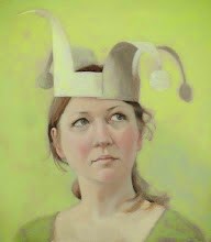
Finally today I have some Michael Harding's Kings Blue Deep, as I was using this in the clothes and background - most of my paintings have one or two guest colours and this is one of the commonest ones. Vasari's Video Blue Pale and Cadmium Yellow have also put in appearances on more than one occasion, as has a blue-red, can't remember which one.

So, that's what I've used for the last six months, working on the show. Next maybe is some still lifes, so I will be breaking out some quite different colours. Or maybe not - we'll see!

Thursday 7 August 2014

Metamorphosis

Everyone loves butterflies, don't they? Caterpillars not so much.

Which is clearly a wee bit of a shame, as most of us spend an awful lot of time as caterpillars, struggling to grow and change into something beautiful.

Saturday 2 August 2014

Painting The Queen

As soon as I knew I was going to have a solo show I asked Moira Buchanan to be the star of the show.

She was the first person ever to be pose for me, back in the days when I didn't know what I doing and needed at least three hours at a time. Since then I have moved into a studio downstairs from hers, making it awfully easy for me to say "There is this idea I've had, would you mind . . . ?". To her ever lasting credit she has been incredibly patient, being willing to lie on the floor with coins in her eyes, have butterflies pinned to her hair and to wear a paper crown, to list just the successful paintings.

This particular painting was an idea I had after I finished The Fool, as I felt every fool needed someone to serve. I also very much wanted a portrait that felt very Moira, with a sense of her mischievousnous. So I was giving myself a bit of a challenge but thankfully everything worked. So much so, in many ways this is the turning point painting of the exhibition, the portrait that made sense of all the rest, to the point I went back and repainted several of them, including The Fool.

So thank you, Moira!