This weekend I took advantage of it being the Glasgow Fair to work on choosing a palette of colours. To do this, I painted the same girl 3 different times using 3 different colour set-ups.
First was the so-called Zorn palette, of black, cadmium red, yellow ochre and white. Paring things right down to 4 colours was very interesting and is something I will do again at life drawing - where you really don't have the time to guddle about with colours. Black is a colour I really haven't used at all, so it was a nice surprise to discover all the deep purples and lovely greens you can mix, as well as how blue the straight black/white mix can look - this will be useful for eyes, I think. Unfortunately, the photo I took was too bleached by light to see the colours - and as it was a pretty bad painting I rubbed it all off.

Second was the brights - Phalo Green, Ultramarine, Scheveningan purple-brown, Cadmium yellow light and Flake white. (there is also black and red on the palette from the first try).
This combination was furthest from my comfort zone, as I rarely use green in painting skin. This particular green was one of the ones I bought for the Peter Cox workshop, and seems very bright - it produced the most complete string you can see, a very neutral mix. Next to it is the ultramarine/purple brown mix, which I deliberately made less neutral and more pink. And next to that, yellow is added - a colour I really under use, so I was pleased with how much it warms up mixes. However, I missed my yellow ochre . . .

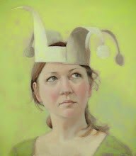
Next up was based on Harold Speed's Oil Painting book (because it was lying around, and is based on the earth colours). He mixes up two blacks - one with burnt sienna and one with cobalt, which is actually pretty useful. The red was a mix of venetian red and burnt sienna - not exactly what he recommends, but close.
I then followed the stages in the book, which initially seemed far too pink, but snapped into place as the painting went on. Shame the underlying drawing was wonky.

Anyway, much was learned - and I like the new palette set-up. It is, of course, based on the previous little squares - the charts remind me where each colour starts and I can then darken or lighten by added the appropriate colour. Cadmium yellow light, for example, is a three to start, so lightens the five of yellow ochre but keeps the yellowness.

There is a painting in progress now using this system, and it does simplify things for me - letting me concentrate more on brushwork and relative colour temperatures while painting. It also makes me think more about composition and colour choices before I begin rather than just rush in. For me I don't think there is one right palette - each situation is different. But the more I understand what the individual colour does, the better . . . .


nice work :)
ReplyDeleteThank you. Sometimes this kind of messing around can be fun!
ReplyDelete