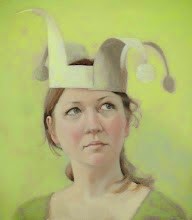
A couple of days ago I had a terrific lunch at Once Upon A Tart with the very talented Cate Iglis - I had the Victoria Sponge, much recommended. Anyway, we talked of many things, including what colours I used - Cate had thought that I might use similar colours to her, as I use greys in a similar way. As it turns out, I don't, and as I struggled a bit in explaining what I do use, I thought I'd write it all down.
The photo above is from this afternoon, at the end of play. Normally it would be a lot messier as this was really a tweaking rather than a laying down large areas of paint day. You can still see the threads I lay out initially - unusual!
At the top is my greys, mixed from Ultramarine and Burnt Sienna, both W+N artist's oils. Today the mix was more brown than grey, it changes every time. The advantage of this, rather than pre-mixed grey or raw umber is that I can change the temperature fairly easily and that the darks are pretty transparent. Both Ultramarine and Burnt Sienna get used independently, especially the Sienna for hair. White, of course, adds opaqueness, the degree depending on which white (titanium or lead) I am using.
Next is an Old Holland colour, Italian Earth, which is basically a less greenish yellow ochre. As you can see, it is a mid tone out of the tube and I progressively lighten it to a tone a couple of stops darker than white. Generally if I need a lighter colour, I need very little and can therefore mix as I go.
Next to my yellow (which is easily the most used colour, especially for light tones) is Vasari's Scarlet Sienna - a lovely warm earth red, that gives both great peach tones and deep reds.
All the other colours change depending on the painting, but most have had Mars Violet, a convincing deep purple out of the tube that lightens to a nice lilac colour - I use this a lot in backgrounds and in the darks and it is very useful in cooling/dulling warmer, brighter reds.
Next is Cadmium Red, a little of which goes a very long way but I really, really hope I will be able to continue to buy this - although I suspect the tube I have may well last a decade or so!
Finally today I have some Michael Harding's Kings Blue Deep, as I was using this in the clothes and background - most of my paintings have one or two guest colours and this is one of the commonest ones. Vasari's Video Blue Pale and Cadmium Yellow have also put in appearances on more than one occasion, as has a blue-red, can't remember which one.
So, that's what I've used for the last six months, working on the show. Next maybe is some still lifes, so I will be breaking out some quite different colours. Or maybe not - we'll see!


A good post on skin tones, thanks, something that engages a lot of interest amongst painters. Always interested in how many subtle coloured greys in paintings of skin, especially like your choices and the cool restrained harmonies you achieve. But artists rarely talk about how the brush shape can influence the look of a work, for instance flat brushes will give angular defined marks while rounds and filberts give more blended results. What do you use? And what size? I suppose there is no definitive answer except the right brush for the job, but would be interested in your views and preferences.
ReplyDeleteAh, Erm, um. Mainly flats I think, in the final stages, quite small ones. first layers tend to be with big brushes, 2 or 3 inches and either flat or filbert. but I do have a lot of brushes and will just reach out. Problem is, brush choice is something I do while painting and that is a time the critical mind goes missing and I really don't remember exactly what I do - it just kinda happens. There might be a blog post in that . . .
ReplyDelete