Showing posts with label portrait. Show all posts

Tuesday, 9 September 2014

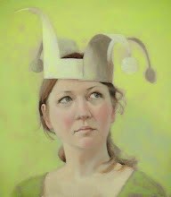
The White Witch

The White Witch was the very first painting painted for the show, after Fran was nice enough to pose for me. She also worked as a sounding board for all the ideas I had and in many ways I felt as if the portrait was keeping an eye on us the whole time, making sure I was at least trying to do all the things I said I wanted to do.

She also brought a fair bit of her own taxidermy with her, but sadly I have not yet been able to incorporate any of them - except this little mouse.

But the show finishes this Sunday so sadly The White Witch won't have her little group of unruly women to watch over much longer, as they all go their separate ways.

Monday, 25 August 2014

Performance - Jane Gardiner's Solo Show

Today I am recovering after the day before, as yesterday was the private viewing of my first ever solo show, at Mansfield Park Gallery. . If you missed it, the paintings will be there for another three weeks.

And I am knackered, both from the drink, the talk and the relief of my part being done.

So I'm having a couple of days off, today drinking tea, lounging with the cat, thinking of all the lovely things people said about my paintings yesterday and maybe drawing the flowers that Fran Hanley gave me later.

Tomorow I go to Edinburgh for the festival and to see what artists are up to over there - particularly looking forward to John Byrne's two exhibitions.

But I thought that now would be a good time to remind folks of where you can find me elsewherre on the internet.

At facebook I am Glasgow Painter , Jane Gardiner is the webpage, with a listing of exhibitions, a bio, and a link to my mailing list as well as my email address. Flickr is mainly paintings and I'm not around there as much as I used to be. Pinterest is full of ideas but I know some people worry about how easy it is to share pictures and that attribution can be lost. Finally, there is twitter.

Saturday, 16 August 2014

The Classic

Another painting from the show, another back view, another beautiful lady.

This time I very much wanted to contrast the warm colours of her skin and the background with the cool, reserved pose. The most detail in the painting is in the ear, an area of the body that is entirely receptive and very individual. It was this balance between control/lack of control, natural/done, warm/cool that I found fascinating. Her hair and make-up is very classic, hence the name of the painting, and of course bare skin is the most classical garment of all - especially when worn with poise.

Wednesday, 13 August 2014

The Clown Princess

The Turn was interesting to paint - not least because it is my biggest painting so far, and the only whole body one - but didn't explore the challenge Donna had set me by wearing whiteface to the modelling session.

This particular pose stood out for me as she looked so regal - almost like Queen Elizabeth the First - despite wearing clowns make up. While she was there we did talk about how the same piece of clothing has different meanings and associations depending on what the are combined with, and one of the things I like about Donna's costume is that each individual item has so many possible associations - the tiara is mine, from my wedding, but is very similar to what debutantes would have worn, as well as the plastic variety each little princess has somewhere. The white make-up has a long association with clownery, but originally was used by court ladies (and some men). Ruffs have also a long tradition, especially in art, that they really deserve their own post. Kohl is of course as old as the hills . . . whereas denim is relatively new but has gathered many associations. Dungarees are workwear, but are also often worn by young children - like those in E.T. Oh, and stripey tops do also have a tradition all of their own.

And those are just some of the more obvious clues - I'm sure each of you will think of your own associations.

Altogether, along with Donna's marvelous eyes and hint of a smile, you get a clown that is ready to rule.

Thursday, 7 August 2014

Metamorphosis

Everyone loves butterflies, don't they? Caterpillars not so much.

Which is clearly a wee bit of a shame, as most of us spend an awful lot of time as caterpillars, struggling to grow and change into something beautiful.

Saturday, 2 August 2014

Painting The Queen

As soon as I knew I was going to have a solo show I asked Moira Buchanan to be the star of the show.

She was the first person ever to be pose for me, back in the days when I didn't know what I doing and needed at least three hours at a time. Since then I have moved into a studio downstairs from hers, making it awfully easy for me to say "There is this idea I've had, would you mind . . . ?". To her ever lasting credit she has been incredibly patient, being willing to lie on the floor with coins in her eyes, have butterflies pinned to her hair and to wear a paper crown, to list just the successful paintings.

This particular painting was an idea I had after I finished The Fool, as I felt every fool needed someone to serve. I also very much wanted a portrait that felt very Moira, with a sense of her mischievousnous. So I was giving myself a bit of a challenge but thankfully everything worked. So much so, in many ways this is the turning point painting of the exhibition, the portrait that made sense of all the rest, to the point I went back and repainted several of them, including The Fool.

So thank you, Moira!

Tuesday, 4 February 2014

Day 4 - The Cat In The Hat WIP

Today I thought I'd show one of the uses of my drawings - to use as a guide for painting.

As you can see, first I start by scaling up and drawing on the canvas with watercolour pencil - I use watercolour pencil because it is picked up by the paint in the next stage and therefore does not show through in subsequent layers. As you can see I had a wee bit of trouble with the drawing for some reason and ended up having to do it twice.

Next is putting in a thin layer of dark, which really creates the backbone of the final painting - the plan is to not put an awful lot on top of this layer. Next the midtones and lights are added - at this stage, as medium is being used and the paint is fairly thin, there may not be a huge difference between these - but the brushwork kind lets me know which is which, when I move onto the next stage, adding colour.

Which I have yet to do - this is the stage that takes the longest generally. Sometimes this works straight off, but more usually I'll spend a fair amount of time wiping the paint off before I get something I like. Oh well. When I do get it finished, I'll post it here - whether that's next week or months from now . . .

Monday, 6 May 2013

Paisley Art Istitue Annual Show 2013

The Paisley Art Institute Open Show opens next Saturday and I am pleased to have two works up on display. This is my fifth year as this was the very first open exhibition I entered, the first time my work was shown to the public - and my first sale!

Anyway, promises to be a good show - I'll try and post my favs on facebook next week - so hopefully you can get along.

(For those of you wondering why I'm posting less these days, it's because big things are afoot.)

Monday, 15 April 2013

Discussing Scale

Just a little one today - at 8x10 inches. Recently I have been thinking quite a lot about scale and I have decided that I will mainly work at a maximum of life size - it just seems to work better for me, rather than the big heads popular at places like the BP portrait award.

Partly this is because that although I do work in (many) layers, what you see (especially skin) is generally done in one go - and that gets difficult beyond a certain size.

The paintings done in the life room are also "one-go" paintings and don't seem to work if any edge is longer than 12 inches. I suspect this will hold true of painting plein air too.

So currently I am investigating supports - how to get good, small surfaces in various proportions - and this seems much harder than you'd think, with most manufacturers producing a very limited range. However, I have found a source of small stretcher bars and am working on stretching and preparing my own small canvases. Boy does oil primer stink!

Friday, 22 March 2013

Recent Paintings by Jane Gardiner

My most recent paintings - properly photographed by Lighthouse Photographics.

Self Portrait at 38 - Winter

Reflection - Self Portrait

In The Louvre

University Blue

The Guard Chair

Sunday, 3 February 2013

Another Self Portrait - Looking Inwards

Yes, there are two self portraits on the go.

But there are two self portrait competitions (the Royal Society one and the Ruth Borchard one ) as well as the BP portrait award and the Royal Society of Portrait Painters normal show coming up. The light is rarely good enough at the moment for photography (and I will be writing why I normally work from photo's in the next few days) so rather than hire a model I thought it would be a good idea to take some of me, then work partly from the mirror.

Although neither painting is close to finished (and, indeed, may never be) it has been an interesting experiment. It has been a couple of years since I've painted myself and I have made a lot of progress in that time - but there is still far to go. I feel I can experiment much more in the application of paint and colour than I would normally - this one has some very deep blues and bright pinks as well as sour yellows. I am trying to pay more attention to the brush work and not feel I need to cover the painting with an entirely new coat of paint each time - this will become increasingly important as I continue to work bigger.

The Royal Society's Self Portrait competition states it wants to be "Pushing the boundaries of self representation in painting and drawing" which is partially why this one has my eyes closed. Working on the two together - this one how I see myself, the other a more straight representation - has been actually quite healing.

Mirrors have long held a horror for me, as the effects of illness and medication (especially steroids) are visible and are about all I could see. However, I am old enough now that I will never be a pretty young thing so it's about time I became at peace with how I look. My husband has helped - at each stage of the other portrait I have asked him what he thought, and each change suggested by him has actually made me look better (and been closer to the photograph).

So although it looks increasingly unlikely I will be finished in time for the competitions, i am glad I tried - another example of setting yourself a project and seeing where it goes.

Friday, 1 February 2013

A Self Portrait and a Manifesto

“A tree growing out of the ground is as wonderful today as it ever was. It does not need to adopt new and startling methods.”

Robert Henri

Please don't think this is a finished painting - and it is a terrible photo - but I thought if I'm going to write every day as I plan for the rest of the month it would help to re-introduce myself.

So yes, that is meant to be me!

Anyway, I am a contemporary figurative oil painter who lives in Glasgow. My overall aim is to reflect the life around me, filtered through oil paints (using both traditional and modern techniques as appropriate).

Each painting of mine should be loved - which means I am mainly interested in emotions. I believe that good figurative oil painting is a deeply felt response to the external world. An awareness of visual arts, both past and present, adds freedom and depth, while conscious adaptation of the appearance of the outside world can be used to get closer to felt truth.

Everything is affected by my experiences of being a woman in the 20th/21st century. This means that both my thought patterns and the world out there is different from that which almost all museum artists experienced so their techniques and answers can only ever act as guides.

(The greatest paintings, like all great things, transcend their purpose and their maker's intentions.)

Will that do as a manifesto and an explanation of my beliefs? If you argue with any of the above, please comment - I would love to hear other folks viewpoints.

Also, I'm hoping to get some kind of dialogue going over the month. There will be posts of work in progress, travel reports, gallery reviews, general art musings and maybe some interviews with other Glasgow Painters - all instead of a drawing a day! So, please join in!

Wednesday, 28 November 2012

Yellow Roses Painting

This is going to be a busy weekend, with not one, but three openings!

The first, on Friday night from 5 til 8, is at Art Exposure, where the above painting will be, along with a couple of small portrait paintings based on New York people. Most of the rest of the show will be small works under a hundred quid so should be quite inteseting. And, of course, the wine, canapes and chat is always good. There is a big, comfy sofa . . . .

On the same night is Virginia Gallery's christmas show. Being a little different, they have gone for a white theme - and I suspect at least a few of the works will be a little naughty. They also promise snow. Hopefully Jon Snow. I would like that.

The next day it is on to the RGI Kelly Gallery for their postcard exhibition - this year there will be small 5x7 inch works unframed for £250 as well as works up to 60cm in diameter. Promises to be very varied - my two little ones are both oils, one a painting done in the life room, the other a small landscape which is part of a new series that I am working on at the moment.

The big brother of the little landscape will be at the Glasgow Art Club Winner's Show from the 8th December - more on that later on!

Wednesday, 17 October 2012

Oil Paintings In Progress

Been busy painting rather than typing as there are a few events coming up - The Glasgow Art Club's joint prizewinner show in December as well as the RGI Kelly and Art Exposure Galleries Christmas Shows.

So here are a few that have been begun - there are a few more finished works lurking about, as well, that will be photographed the next time there is a sunny day.

Monday, 10 September 2012

RGI 2012

Well, this year has been a little frantic, what with planning the New York trip, and then trying to internalise all the new stuff I learnt and saw while there - a process that is still very much ongoing.
So when this years Royal Glasgow Institute Annual Show entry date came around, I wasn't really prepared. Fortunately, with the help of Donna Nicholson Arnott , we managed to choose which paintings, got them all titled (although one has had a title from the start - more on that in my next posting) and labelled and then delivered to the Mitchell. Then it was time for (a very leisurely) tea at Tchia Ovna, a place that oddly I had never been beofre.
A few days ago I got the dreaded letter through the post - I hate waiting for news - and it was good! Two of my paintings have been accepted - Mimi above and The Little Mermaid - I am so looking forward to seeing them hanging up. The Mitchell is a lovely space and every year there is some amazing work on display, so it will be heart warming to see mine amongst them.
Everyone is, of course, invited along - the show opens on Sunday and runs until the 6th of October.

Wednesday, 18 July 2012

Palette Mixes - Earths vs Brights

This weekend I took advantage of it being the Glasgow Fair to work on choosing a palette of colours. To do this, I painted the same girl 3 different times using 3 different colour set-ups.

First was the so-called Zorn palette, of black, cadmium red, yellow ochre and white. Paring things right down to 4 colours was very interesting and is something I will do again at life drawing - where you really don't have the time to guddle about with colours. Black is a colour I really haven't used at all, so it was a nice surprise to discover all the deep purples and lovely greens you can mix, as well as how blue the straight black/white mix can look - this will be useful for eyes, I think. Unfortunately, the photo I took was too bleached by light to see the colours - and as it was a pretty bad painting I rubbed it all off.

Second was the brights - Phalo Green, Ultramarine, Scheveningan purple-brown, Cadmium yellow light and Flake white. (there is also black and red on the palette from the first try).

This combination was furthest from my comfort zone, as I rarely use green in painting skin. This particular green was one of the ones I bought for the Peter Cox workshop, and seems very bright - it produced the most complete string you can see, a very neutral mix. Next to it is the ultramarine/purple brown mix, which I deliberately made less neutral and more pink. And next to that, yellow is added - a colour I really under use, so I was pleased with how much it warms up mixes. However, I missed my yellow ochre . . .

Next up was based on Harold Speed's Oil Painting book (because it was lying around, and is based on the earth colours). He mixes up two blacks - one with burnt sienna and one with cobalt, which is actually pretty useful. The red was a mix of venetian red and burnt sienna - not exactly what he recommends, but close.

I then followed the stages in the book, which initially seemed far too pink, but snapped into place as the painting went on. Shame the underlying drawing was wonky.

Anyway, much was learned - and I like the new palette set-up. It is, of course, based on the previous little squares - the charts remind me where each colour starts and I can then darken or lighten by added the appropriate colour. Cadmium yellow light, for example, is a three to start, so lightens the five of yellow ochre but keeps the yellowness.

There is a painting in progress now using this system, and it does simplify things for me - letting me concentrate more on brushwork and relative colour temperatures while painting. It also makes me think more about composition and colour choices before I begin rather than just rush in. For me I don't think there is one right palette - each situation is different. But the more I understand what the individual colour does, the better . . . .

Thursday, 28 June 2012

Small Beauties at Art Exposure

Everyone is invited to Art Exposure Gallery tomorrow night, where I'll be showing the above painting ("The Profile") as well as the two below - the first of my New York paintings to go on show!

There will be nibbles and wine and good chat, as well as my paintings hung in a group (there are a few others going on show) and of course many other painters work on show.

Wednesday, 27 June 2012

The Little Mermaid and The Frick

Also recently finished (maybe) is this one, which has also gone through many stages since it was begun back in Vytlacil. She is based on photographs I took of what appeared to be a model shoot at the Staten Island Ferry terminal. There was something about the light that was just magical as well, of course, of all the effort that had clearly been put into her clothes, make-up and so on.

Later that day I visited the Frick, which I heartily recommend for anyone interested in paintings of people. They have an amazing collection of first class paintings that span from Holbein's Thomas Cromwell to fine Degas , hitting various high points along the way. Almost all of the paintings are not only by great painters but are among the best of their works - the Raeburn's , for example, are top notch, which is quite impressive. Having such great works in close proximity makes it very easy to compare and contrast and try to have deep thoughts. There isn't the scope of the Metropolitan, especially as almost all paintings are portraits. This is, of course, also a strength.

So, after seeing all these three-quarter length portraits I wanted to have a go myself - and this is the result. She started out much darker but seemed to become more mermaid-like as she progressed. I had gone on the ferry as I was missing the water (having grown up by the seaside and having a view of the Kelvin from my front window) and every time I started painting it took me back to the pleasure of the ride, the mystery of the sea and rivers, and the unfathomableness of what goes on behind another person's eyes.

Monday, 25 June 2012

The Princess

Here is the (probably) finished version of The Princess - she was the last painting I started in Vytlacil, and was hung on the wall at the opening while the paint was still wet. Back then, she had a yellow background and grey clothing - originally she started as an exercise in using raw sienna as a background. That didn't work out - turns out the paint was both too opaque and too transparent for what I was after. Never mind, I'll try something similar on another painting soon.

So, now she surrounded by shades of green/grey/blue and is looking much calmer - originally she seemed to have a little bit of a sneer to her, which just did not seem right. A real example of the painting taking over and the reference material being left far behind.

Looking at her here on the blog it is clear I am very drawn to these types of blues - all my most recent paintings are very blue themed. Oh well. Guess I should keep experimenting with the colours . . .

Just spotted something I want to fix. A painting is done for me either when I run out of things to improve, fixing it means starting from scratch, or when it has to be taken to a gallery to be sold. How does everyone else decide?

Wednesday, 23 May 2012

Blue Hair and Aquaboard

This one is a study done for a bigger painting that if you have sharp eyes you may notice in the studio shots. The big painting has been a lot of hassle and I am still not entirely happy with it - will post it sometime soon. This little one (13x13cm), though, just worked first time and is why I decided to go bigger. It is painted on aquaboard, a new thing to me, but appears to be quite common in American art supply stores. It is made by Ampersand (who seem to do a big range of boards) and claims to be of archival quality - "watercolors on Aquaboard can be sealed and framed without glass, keeping colors and textures true to life". The surface certainly feels like cold pressed watercolour paper and is ivory in tone. The paint seemed to take longer than I'm used to, which made me impatient as I was wanting to layer. But this could be a strength, as it would maybe give lots of manipulating time. Will report back after I have used it a few more times.