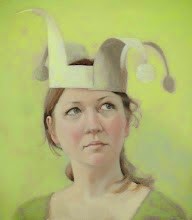
At the weekend I started a new painting - did a rough drawing in watercolour pencil then re-inforced and corrected the outlines with a small brush and a dark ultramarine/burnt sienna mix. It was looking good.
So I continued, adding the basic tonal structure using three tones using the same blue/orange mix along with white. All was going well, I was satisfied, so I moved on to other stuff while I waited for the (very thin) paint to dry.
But then I looked at it again.
And I didn't like what I could see.
The whole thing was too far over to the right. I had wanted to un-center the pose, to emphasis the lovely line her neck makes as it goes down towards her shoulder. But this was unbalanced. So I decided to start again.
I tried scraping with a painting knife (all the books mention artists doing this) but not much happened - maybe because the paint was so thin. Next up was turps, which as you can see in the third image in the slide show worked much better - and left a lovely ghostly image. I seriously considered stopping right there.
But I didn't. It wasn't the image I meant to make, so although this is a technique I may well explore at a later time, it wasn't right for this painting. However, painting on top of the ghost image was hard. Real hard. The last image is not right - but the flaws are relatively minor and can be fixed at the next stage - when I add colour. If I had continued, I may have ended up with a well painted portrait that just looked wrong no matter what I did. Whereas now I have painted over a couple of nice images to produce a not-quite-right image that should be use-able as a strong base for a finished painting.


Tip 1: start a painting with very thin oil paint diluted with turpentine and a fine brush - blue or a siena is what I use. Then if you don't like the drawing you can easily rub it out with a rag.
ReplyDeleteTip 2: for portraits, the leading eye should be in the vertical centre - in the case of this painting, her right eye (on your left). I usually draw the vertical centre line in dilute paint right at the beginning. I tend to find that the composition looks good when the leading eye is about 2/3 from the bottom of the canvas.
Thanks, Martin - indeed, one of the wrong things as it is now is the positioning of the eye (and features in general) - next step will be to go back with a fine brush and thinned paint and re-draw these.
ReplyDelete